|
Here is what I've been working on at home! My first art assignment is close to finished, and my second is still conceptually in the works. For this first one, I was inspired by the Geurilla Girls and I chose their art assignment. I want to cover them in resin so they are slightly reflective like a mirror, but the words block you from fully being able to see yourself. I'm in the process of touching up the letters and outlining some of them in red.
0 Comments
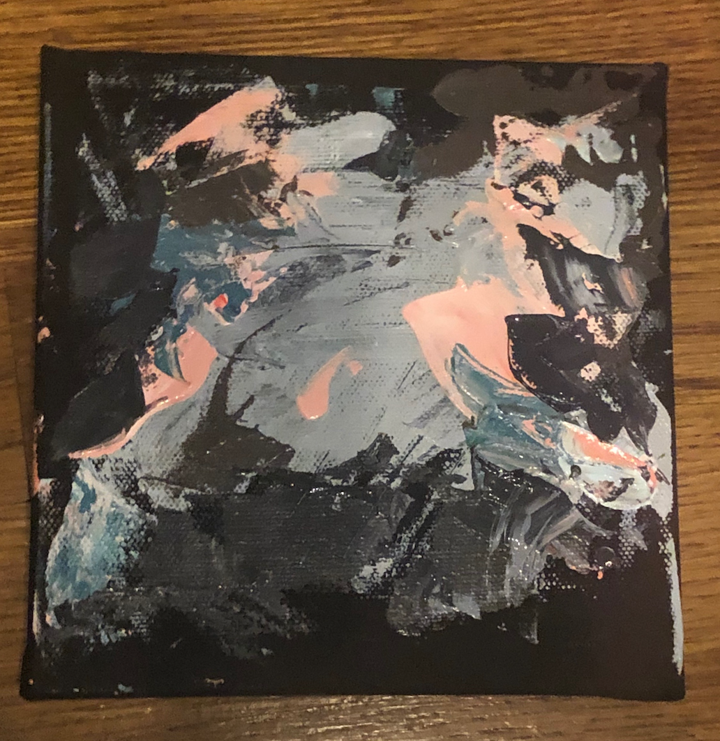
I covered up the yellow on my first piece, made a skin and ripped it to add to the side of the piece which I feel like is successful but I can easily remove it if it makes the piece too busy, and I went in with drips. I feel like the piece is resolved except for the top right corned but I need opinions! On the second piece I tried a new composition that I don't like, at this point I'm kind of using that canvas for experimentation and the first canvas as a real piece if that makes sense? I'm going to continue adding layers but I think my next step is going in with some white (or some kind of white type color) to correct a lot of it and build up a different composition. I tried to make dark blue drips with black drips and for some reason it came out green like the other drips did. I want to keep playing with new textures though I really enjoy it. QUESTIONS/GOALS/THOUGHTS:
In-Class: I got my palette and new knives! I'm super excited to use them, I feel like they'll make my paintings more interesting. One thing I've learned is that when I make a color I don't need to use a ton of it on my painting, a little goes a long way. With this process thought, a lot of paint mixing results in a small new layer. It may look like I haven't gone far, but it really was a ton of mixing colors to get what I wanted. I have a lot of white space on the bigger canvas, so I'm gonna try to go in with drips and put some paint on the bottom as well, but I'm gonna look over some other painting first to see what compositions work. My biggest focus right now is just having a successful composition.
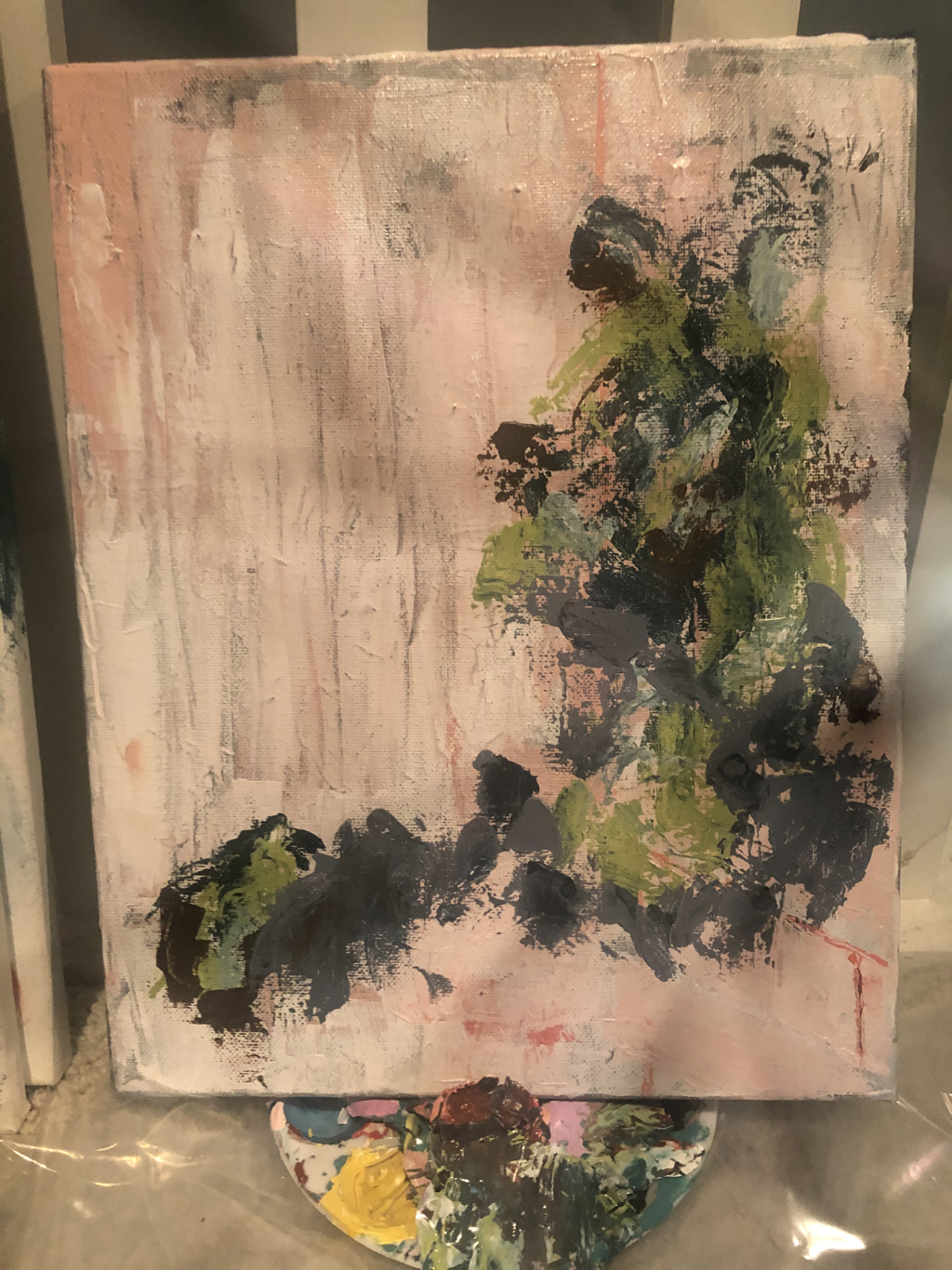
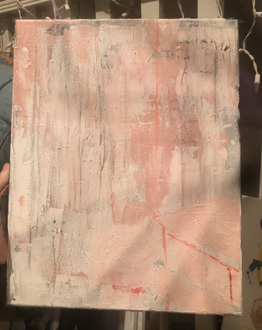
In Class: I repurposed a canvas from an older unsuccessful painting that I feel like I could not improve with more layers. I used my palette knife to make a new pink and white layered background that I could build on, to give more character to the first layer of the piece. The one hard part working in layers, but the good part about having two pieces going at once, is that I need the paint to dry before adding more layers (SOMETIMES). It depends on what I am going for, but in this case I wanted the paint to dry before continuing on so I went to my second piece. In the past I have stuck to blues and greens as a first layer, using a large shape to build off of. That has made me feel limited in the past because I never wanted to completely cover the shape. To help solve this problem I made the goal to use different warm colors and different marks to create my first layer, still with a focus on composition because that is what I failed on with my first pieces. One thing I have a hard time with is figuring out colors that will go well together in the end, because like any normal person I hate colors like a brown-green color, lime green, the combination of pink and brown, or anything related to orange. I know I can't limit myself like that though, and I've had some success with using those boring colors in the past but I wish there was a way to study how to successfully combine colors.
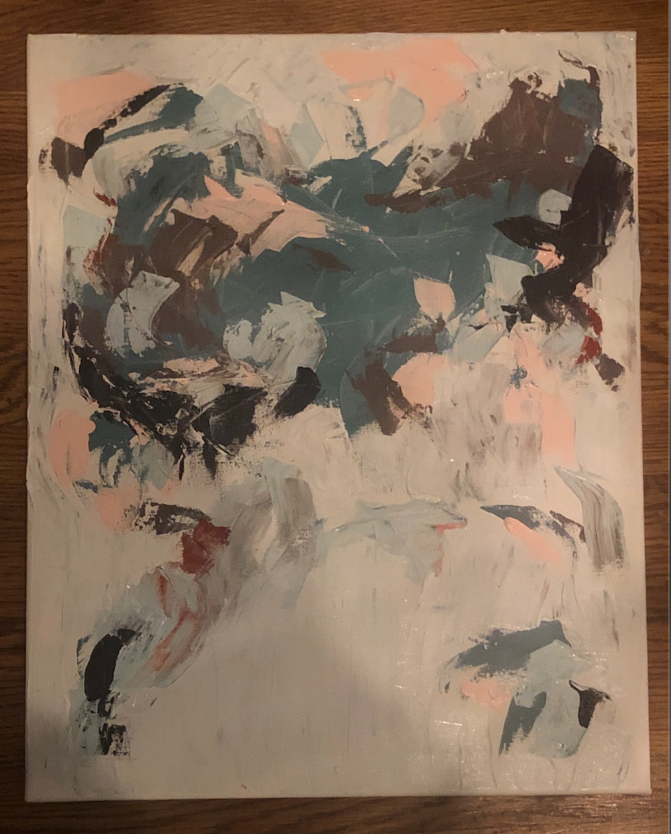
So after this week I've realized that I need to get a flat palette and a smaller palette knife. I took advantage of my curved palette knife by blending my colors together on the piece to the right to create my shape. I hate the color scheme but I know the majority of it is getting covered. I think I'm gonna go in to the next layer with a dark blue and then carve out with white. I don't want the piece to get too muddy or messy which is why I think I'm gonna go in with white. For my piece on the left I think I'm gonna start with a few cool colors towards the corner and use some thin paint for the drip effect. I'm not sure yet though, these pieces are very different from my other ones so far and it's kind of out of my comfort zone. I'm not rushing these because I want to make each layer purposeful and deliberate rather than rushing like I did on my old pieces. Slowing down has allowed me to learn a lot so far! QUESTIONS/GOALS/RELIZATIONS:
At Home:
I have never made a flyer before. And I don't want to go digital. I am really currently wishing I had a method of screen printing at home, but while I figure out the way to create my flyer I have gone through more ideas and sketches to figure out what to do. Regarding my second art assignment, I know I want to do the 'Never seen, Never will' assignment, but I want to make it heavy in content. Like along the lines of a smile from someone who is going through a mental illness such as depression. Not that actual idea, but thats just a cheesy example of what I am going for. Or I might go the very opposite direction I honestly don't know yet. So far my ideas are uninterrupted sleep (or a full nights sleep in general), still hands in a crowd of people, the end of a chapstick tube, and a peaceful family dinner. I bolded the ideas that I think are more realistic in regards to depicting it in an artistic way. For the chapstick I could attempt a painting? or drawing of a hand spinning the bottom of a chapstick to reveal the plastic end. I'm not sure the best way to depict the hands one but I do really like that idea. WEEK REVIEW: I haven't been feeling well lately and with Covid it's making me super paranoid and decreased my productivity level. I'm hoping I can get my energy back soon so I can keep grinding! Even if I can't physically paint I'm doing the best that I can to learn and plan to allow for successful pieces. I'm hoping I'll be well by class on Tuesday This week, due to my inability to go to Plaza art, I focused more on research for my project and planning for my art assignments. My favorite abstract artist at the moment is still Joan Mitchell. I have been focusing in the past on color blocks as my background rather than brush strokes and layering to create a larger shape. I am taking inspiration from these few pieces as my next work. To solve my problem of practicing layering, I have decided to make two piece to try to see how I can use my palette knife, layering techniques, and mark making to create my piece and maintain an interesting competition. I have yet to experiment with paint texture, and I think it is something I want to explore in my next paintings. More specifically, thinning paint to allow it to drip on the canvas. I think I'm going to avoid using thick paint because thick paint makes layering very difficult but thin paint can easily be covering if the experiment does not go well. I also have hid behind white in my past paintings, and I want to make my usage of white more deliberate regarding composition.
HOME PROJECT: I have not gotten pen to paper for this project either. I have decided to do the Geurilla Girls assignment 'The Art of Complaining' but thats the only confirmed idea I have so far. I did apply for the Guerrilla Girls workshop for Studio 23, hoping that it would aid me in this project and the opportunity to work with them would have been amazing, but I knew it was a long shot and I did not get in. While slightly sadden, it was expected. My ideas for 'complaining' are very large concepts because over the summer I became very passionate about different social issues. My ideas so far are comparison between girls over social media, censorship, and the connection of morals to politics. I want to display this in a flyer so I can combine the project with the 'Fake Flyer' assignment. I have not thought of a composition yet. My second art assignment is yet to be decided! I want to explore a different material but I am not sure exactly what yet. 6/30:
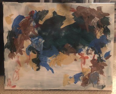
I decided to take my abstract paintings and make them a lot bigger for my summer project. I got new pallette knives so I would have something new to work with, and I'm planning on using my pointers from my last critique to make this painting. I really want to blend more of the colors together while it's wet. I ended up starting with that blue color that was similar to my last painting which was unintentional. 7/18: I think the one thing holding me back from this painting is my lack of color choice. With the school paints now back at school it's hard for me to get creative and make the colors I want to. Right now (3rd picture) its giving me too much 2014 scene tumblr type color scheme so I'm trying to add more neutral tones. I'm loving how the colors are blending together while they're wet though. I also forgot to mention that I'm getting color inspiration from crystals. All crystals have certain healing properties and help with certain aspects of your life. I'm turning my summer into a painting by using colors of crystals that have either helped me or describe what I have been experiencing. This is slightly difficult though because I do not have a lot of paint. That's definitely something I either need to pick up from school, get at Plaza, or invest in myself. 8/29: I don't know. I'm happy with it but also not happy with it. I blended my colors, I painting the background with the dirty white which I love, and I think I have a good composition. I think the crucial thing is the color I start with. I don't have a lot of colors here, but I wish I started with a warmer tone. The blue was inspired by Blue Calcite and Angelite, even though those crystals have more of a light blue tone rather than green, because I've been traveling with those everyday. I don't think it worked in my favor, and I'll be going in a warmer direction with my next painting. I, however, do enjoy the larger canvas much more than any of the smaller ones I've worked with. I think I'll be continuing on this path and using my critiques from this painting on my next ones to make them progress more. I think this painting is visually similar to my last one, but white more blending and slightly more elevated skill.
I decided to use a palette knife for all my paintings this time because it felt a lot easier to make unique marks with it when I used it on my last set of paintings. I started with blocks of color rather than painting the whole canvas and using white to create a block of color and I like how that looks a lot. Then I went over with a lot of random strokes, trying to create contrast between dark and light colors. On the white canvases I went over the blank canvas areas with white using a dirty palette knife which created a cool effect, it shows up better in person. My favorite on is the horizontal blue one with the brown, and my least favorite is the green with the orange ish color because I'm not a fan of the color scheme and I don't think the composition looks solved. Theres no meaning to any of these but I'm working on some ideas for my summer project.
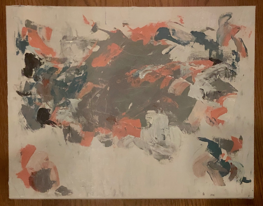
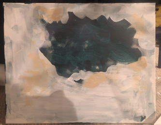
These are my final, for now, canvases (excluding the smaller one) for this critique. I think its a significant improvement from the last piece, but I still feel like they could use a few more layers, but I'm not 100% sure and I wanted to hear other people's opinions before I continued. If I were to add more layers I would go in with charcoal to make marks and then add small brush strokes of different colors to create more movement through the piece. While making these pieces I was inspired by the works of Joan Mitchell and I hope to keep exploring other artists to create my own voice within the style. I really like layers I started with even though it created somewhat similar pieces. I want to apply a similar process to other pieces but in slightly different ways to create a cohesive and interesting body of work. ALSO disclaimer, I know my photos in my gallery are subpar, but my cracked iphone camera was all I had to photograph with, these photos will be replaced soon once I get a hold of my sister's real camera and we create a proper set up. I promise the paintings and their colors look a lot better in person and I'll fix the photos asap.
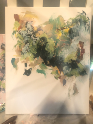
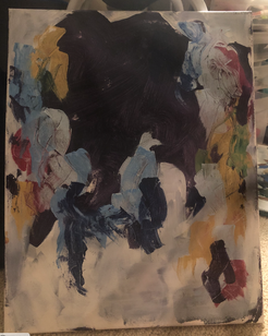
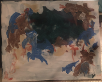
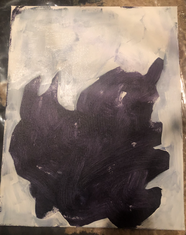
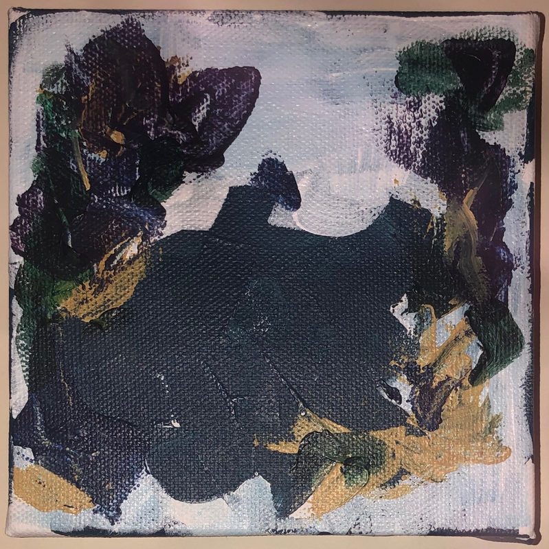
I now have four or five canvases going, but these are the three I'm most happy with. I continued to add colored onto the painting pictured on the left. I used a large palette knife which I've enjoyed a lot more than brushes because of the abstract mark making I can create with it. I think I am going to bring the green to the top again and then add smaller brush strokes to tie the whole pieces together. Pictured in the middle is the second layer on a canvas I started a little bit ago, and I used the same process I used on the green one to create this kind of abstract shape as my base. I really like this process and I feel like it creates an aesthetically pleasing piece. The third canvas is a baby sized canvas that I decided to do a similar process on but I started with a wet brush and didn't use a palette knife. It didn't turn out as different as I wanted it to but all of these are practice with the style and works in progress, however I think they're an improvement from my last piece. I have some other canvases going that I'm not huge fans of (more specifically a large gray and yellow one that I might start over because I don't like the way the brush strokes blended and made a flat surface) so I've been focusing on these ones. I know its not as many pieces as I was hoping to get done, but with everything that has been going on lately I feel like I'm at a safe pace.
|
Julianne
|
 RSS Feed
