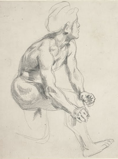
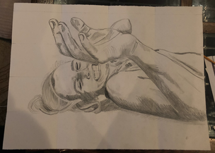
This was an interesting process. I realized that my masters mark was easier to recreate than it was to copy because trying to perfectly replicate freehanded scribble-like marks is extremely difficult. When I started it was a lot less difficult than I thought it was going to be and I was able to get the whole hand and arm done in one sitting. My favorite part of the portrait is the hand, I feel like I really recreated my master's mark successfully. Throughout the process my face was kind of terrifying and I still think it kind of is but it got a lot better when I fixed the way the mouth curved, the height and angles of the eyes, and the length of the nose. I am pretty proud of my portrait for having never done portraits before but I don't love it.
0 Comments
Abstract Expressionism
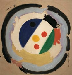
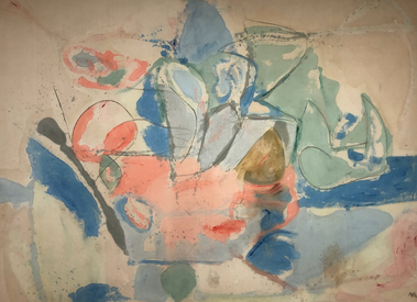 Mountains and Sea HELEN FRANKENTHALER oil and charcoal on canvas, 1952 The Clown: I love the bold colors in this piece that almost appear like they have been spray painted because of the faded edges. There aren't many small loose marks which is pleasing to look at in comparison to many small marks. Its not overwhelming to look at which makes it more of an unexpected piece for me. The powerful marks and bold colors are different than a lot of the other works I've seen. 27 May 1948: For me this piece was an obvious Abstract Expressionist piece but it is kind of basic in my opinion. This is what I typically picture when I think of an Abstract Expressionist piece. The dull colors that are all kind of the same tone did not excite me. However, the marks and brushstrokes are very distinct which I admire and want to recreate. I like some of the color contrast with the blues and browns but I plan on working with less earth tones. Some of the dripping and the way the colors merge together in some areas is satisfying and something I want to try to replicate in my Abstract Expressionist piece Mountains and Sea: The color palette of this piece is beautiful. I love the layering and the appearance of water color with the difference colors and lines. This piece makes me debate whether I want to focus more on bigger brush strokes or having colors bleed from smaller marks. The marks are a lot more sporadic and random than the others, and the use of texture adds another effect to the painting. I love the application of the paint and the way it appears splattered but blended at the same time. One-Line Play Page Inspiration
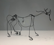
The room fill with Alexander Calder pieces left me in awe. I could have stayed in there for the longest time and still been intrigued by his work, I only wish I could have gotten closer to it (as most of it was in the air and too far away for me to see the little details) After seeing this room I have so many ideas of materials I want to work with and directions I want to go in but I am not sure exactly how to. I don't have a picture of it here, but the animal sculptures made from sheets of metal were beautiful and something I want to explore.
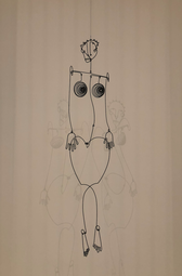
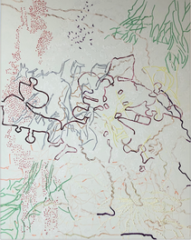
Aztec Josephine Baker: I LOVE the hands on this piece. The medium is something I want to explore further and practice with, along with the style. He somehow makes the figure so simple but captures all the necessary details. The curves of the legs and body are so basic but perfect and I love it. Its not all completely attached so it is not truly one line but it gives the appearance. The presentation of the piece adds to it because of the shadows on the wall. Cow: This piece is so detailed but also so simple and it amazes me. I want to learn more about his process and how he creates such small bends and loops in the wire and what exactly what materials he uses. Consequence: This isn't Alexander Calder or actually one line but it still inspired me. The layers of broken lines is something I want to explore with my play pages. My play pages have become really specific and repetitive and I want to branch out from it (even though I love it). I really want to paint and I think this would be a good approach (painting with multiple lines and just letting loose with it). I feel like incorporating a style like this in my ABEX piece would be beautiful. 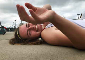 I chose this image for my self portrait mostly because of the lighting, that will work well with my old master's style of shading, and the foreshortening with the hand that I feel will turn out really will with Delacriox's style. I am nervous for the face because it is a full face image which contrasts with my original piece by Delacroix which was only a simplistic profile. I ran into a lot of issues with the face especially because it is sideways. For most of the process my face looked okay when looking at the drawing the way it is suppose to be, but when I turned it and looked it vertically the face was kinda terrifying. It took many tries to fix and I ended up lowering the eyes a lot and fixing the angle and in the end I still feel like my forehead is kinda massive (because I lowered the eyes so much) but I think it ended up pretty okay. I still think I look a little terrifying but I am really proud of the hand. I think I did a good job matching my masters mark with that specific part of the drawing.
|
Julianne
|
 RSS Feed
