|
With the opportunity to explore an online gallery, I knew I had to explore the Museum of Modern Art. It is my dream to explore the museum in person, but for now I will take what I can get.
0 Comments
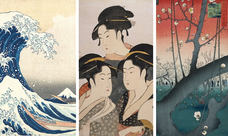 We, as Art V students, have heard the phrase 'Wabi Sabi' before. In this lecture, that phrase was broken down and we learned the real meaning. Wabi is the key aesthetic beauty principle in Japan, based on the Shinto belief system. Basically, they wanted to have the natural look with all the dimples, cracks, etc. This was a very different belief to many Western aesthetics that valued perfection in everything. There are three main aspects to Wabi
1. simple/unpretentious (one of poverty and disappointment 2. imperfect/irregular (to be incomplete is more beautiful than to be complete, a deeper beauty in the blemishes) 3. austere/stark (a desolate cold winter scene) Sabi is the lonely beauty that is tinged with a sadness or melancholy, and refers to ability to have the capacity to be aware of your surroundings and have an experience with them. We also learned about Yugen, which was an important Buddhist idea. It refers to a sense of mystery or depth into feeling and before you are fully aware it moves on. Tanizaki, an important Japanese novelist, was also discussed. In many of his works he juxtaposed traditional Japanese men and women to the traditional men and women in the west. He was quick to respond to what was occurring around him, which was a lot considering it was a war period. He responded to the question, "What makes us unique as Japanese people?" with his works. He often wrote about vulgar topics and compared them to the classic aesthetics and glorified them. Japanese aesthetics have always been very interesting to learn about. I feel like there is not a similar subject to compare to in American art history which makes the topic very intriguing. I feel like most of this lecture was review, but it is always nice to get an art history refresher from the beginning of my art career at Maggie Walker. I absolutely fell in love with Keith M Ramsey's personality from this interview. His outlook on life and art is amazing and one that many people should follow. For a little background, he went to VCU and ended up getting a job in graphic design (more to make money and keep making art but not really what he wanted to do). Eventually he was fired from the job and took that as the chance to make what he wanted to. He started producing practical work, such as railings. Now, he gets clients that trust his vision and he gets to make whatever he wants. The one thing I loved most about his approach to art is his 'why not me' mindset. He works with so many different mediums and materials because when approaching a new project or assignment he says 'why not me?' Why can't he be the one to make it? He said his girlfriend says he has "creative ADD" because there are so many things he can do, which I thought was a really accurate way to describe his work. He approaches all of these materials because he loves trying different things, says 'why not me', and also has so many things he wants to say and he wants to express them. I love how he takes every opportunity that comes to him and just tries to see if he can do it, without much planning ahead of time. I also loved his enthusiasm for objects like a rusty nail, saying that you can never find something with that texture, age, and color. Hearing him describe his found objects was truly refreshing. I learned a lot from his outlook on art and opportunities.
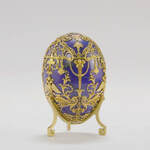 I typically am not a fan of any historical Russian art so listening to this lunchtime lecture was similar to doing a curiosity page for an artist I hate. Faberge eggs started when Nicholas II gave an egg as an Easter gift to his wife Alexandra the Feodorovna in 1903. The faberge firm presented a bill to Tsar Nicholas II for 9,760 rubles (an average wage earner would have had to work fo r296 years to afford this egg).
Faberge's work masters used four different colors of gold and many diamonds, rubies, rocks, and crystals. Inside the egg is an object made of gold with a large sapphire. Lilian Thomas Pratt bought the egg when it was in the hands of Alexander Shaffer, he was asking for 10 times the price than he paid for it. One of the faberge eggs was recently bought by someone from the US Midwest for 14 thousand dollars. McCarthy, an antique dealer, bought the egg for 33 million dollars from the buyer. The others (7) are still missing. Gustav Faberge opened a workshop under the name of faberge in a cellar. Karl Berge grew up learning how to work with gold, silver, and jewels from his fathers Finnish work master. He returned to St.Petersburg and continues to learn the family business. He then began a line of gold jewelry that was inspired by archaeological artifacts. Feodorovna purchased a pair of cuff links, the first imperial purchase from Faberge (one of veryyy many). Faberge built a 5 story building that developed many objects and gift boxes for each individual item. He never actually made anything himself, and none of the 5,000 things he made were the same. While I don't really like this style of art, I can appreciate the work and value of the pieces. The thing I found most interesting was the gap between Faberge and the work itself. His fame and fortune is beyond compare but he never actually made his own pieces. Almost everyone can recognize his name but what about the names of the workers who made the pieces? He is more of a businessman than an artist, but I want to know more about how that link worked. Did he workers get just compensation? Overall it was very interesting to hear about all the Russian history and how important Faberge's (or should I his workers') work played such an important role in the royal realm of Russia. Reflection Although I am not planning on going to an art school I felt like this was a very insightful and interesting talk, especially since my sister is now a sophomore at VCU for art. I like how we had many people having a conversation about the arts in college rather than one person speaking on the subject, I felt like hearing all the different perspectives about their different paths added a lot to the subject. My sister had a pretty similar path to Eli, as she wanted to go to art school because it's her passion but her style of art is not what people typically want. When she took AFO she felt like she was doing mostly busy work because it wasn't exactly what she wanted to do. She favors drawing fossils and extinct animals which is pretty unusual, except she found her place in scientific illustration.
I learned that professors in college for art are more of mentors than teachers telling you what to do. They give you an assignment but you're completely in charge of the idea, it's partially self directed. It was interesting to me how some people felt like there was a lack of representation in professors and peers causing a lack of connection. It makes complete sense, as ones self shows up in their work and without a connection from student to teacher theres a barrier between the work and the content. I didn't really realize how amazing the VCU facilities are, even though my sister goes there. The fact that they have open spaces for students to create is amazing because everyone gets creative impulses at different times and should have the resources available to them to create what they want. What I mean is that their art-making-time shouldn't be restricted to a buildings schedule (for the most part). I thought Jack's input was particularly interesting and real. And I've heard similar things from my sister. I feel like VCU tries to get everyone who isn't a real artist out of the program with AFO, even though the difficulty truly depends on the teacher. I also thought that hearing about the architecture program was very different because I've never really thought about that career before. Describing as a creative outlet with clear directions and guidelines makes complete sense and is a very different way of looking at it to me. Overall, hearing about everyones experiences and input about art schools was very informative. I feel like I could never do anything similar to the work they do in school. I'd prefer to keep it as a hobby, as I wouldn't want art to turn into work rather than a creative outlet. Having an art class for me now is motivating me to continue creating, and I hope to do something similar in the future so I can continue building my portfolio, but I don't think I'll be attending anything as extensive as an art school. mad respect to the people who do
colors attracted me, as that is normally what I experiment with. Hiroshi Wada works with modernizing the process of "shodo", brush and ink drawing on rice paper. He says that his medium has the power of bring joy and playfulness to the viewers, which is what I tried to do with the colors in my embroidery piece over the summer. Wada also says that hopes the meaning of his pieces is convey to, and felt by, his audience. He tries to reflect relaxation, reflection, and peace. This is similar to my body of work as I try to reflect how I feel while making the pieces in the viewer. The point o my artwork, for the most part, is to make the audience think about other perspectives during difficult times. I am inspired by Hiroshi Wada's use of line quality, and I hope to experiment with something similar in the future.
Here is the link of the online gallery that I toured virtually: Click here for the virtual tour (and scroll to "Hiroshi Wada: The First New York Solo Exhibition, In and Out of the Garden") Click here for more information on Hiroshi Wada  John Freyer is a social practice artist from Richmond, Virginia who has a focus on getting rid of the stigma around drug addiction. His Fifty/Fifty project is a traveling series of interdisciplinary, social practice art that creates and contributes to the dialogue around addiction and recovery by taking part in local, regional, and national events. The first of the 3 parts of the project was the Free Ice Water project. This was based on the concept of him learning how to listen again when he first started recovery. The idea was that two complete strangers would sit across from each other and have a conversation based on the prompt, "Talk about a turning point in your life." The second part of the series was Free Hot Coffee. This was a partnership with Rams and Recovery which is VCUs program for students who are in recovery/sober. John Freyer and the students in Rams and Recovery made what they call a 'Recovery Roast' which is a blend of coffee. They built a bike to travel and share their story and spread the idea that people who are recovering can be like everyone else and get a job and live independently. In a way it gave people in recovery someone to look up to. The last part of the project was Free Hot Supper which cumulated an opportunity for a larger dialogue with diverse and unexpected audiences, and it incorporated the ally concept they came up with earlier. Allies are people who don't want to talk about their past addiction or the topic itself, or may not have even had a past addiction, but they are supportive and understanding. I am really intrigued by Freyer's work. While it isn't something I would try to explore myself, I love all the concepts and want to learn more about his other projects (such as 'All my Life for Sale' in which he sold all of his belongings and traveled around the world to meet the people who bought something, and I'm curious why he did this and how he lived afterwards). The message he puts out with all of his work, removing the stigma attached to addicts who are recovering, is something I feel like isn't talked about enough today and something society should work on. His message is sent out in a very unique and interactive way, and collaborating with college kids adds to his exposure. I love the fact that he makes a coffee roast with them, I feel like thats a really creative and smart way to make his art interactive and always changing. I really like his work and I look forward to seeing what he does in the future. I've experimented with making videos before, obviously nothing to this extent though, because it has always intrigued me and I love editing videos. Whenever I go on trips I take little videos of anything and everything and in the end when I get home I put them together with music (to me, its extremely satisfying). I want to look more into it to see what else I can create, and I love what Sasha Water Freyer had to say about it. Her job connects with her passion, but it's also like a hobby for her. That scares me a little because I feel like I would slowly lose the time to edit all of the film and then eventually just stop making them. All of her work are long projects created over a long period of time, which i think is really cool because your vision.goal can change so much during that time, but you also get such a long time to think about it so in the end it really is what you wanted. She runs into issues that the majority of people have issues with (finance, time, etc). I also love her emphasis on studying what you're passionate about. A lot of people, especially people my age, gravitate towards what their friends are doing, are pressured from their parts and do what they want, and/or don't even know what they want to do (which is me). That's all understandable, and I know at some point I'll find what I want to do, but some people don't ever plan on abandoning their parents dream for their own, which is terrible life to live because you won't succeed without doing something you don't love.
Abstract Expressionism
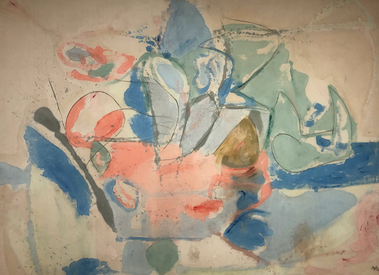 Mountains and Sea HELEN FRANKENTHALER oil and charcoal on canvas, 1952 The Clown: I love the bold colors in this piece that almost appear like they have been spray painted because of the faded edges. There aren't many small loose marks which is pleasing to look at in comparison to many small marks. Its not overwhelming to look at which makes it more of an unexpected piece for me. The powerful marks and bold colors are different than a lot of the other works I've seen. 27 May 1948: For me this piece was an obvious Abstract Expressionist piece but it is kind of basic in my opinion. This is what I typically picture when I think of an Abstract Expressionist piece. The dull colors that are all kind of the same tone did not excite me. However, the marks and brushstrokes are very distinct which I admire and want to recreate. I like some of the color contrast with the blues and browns but I plan on working with less earth tones. Some of the dripping and the way the colors merge together in some areas is satisfying and something I want to try to replicate in my Abstract Expressionist piece Mountains and Sea: The color palette of this piece is beautiful. I love the layering and the appearance of water color with the difference colors and lines. This piece makes me debate whether I want to focus more on bigger brush strokes or having colors bleed from smaller marks. The marks are a lot more sporadic and random than the others, and the use of texture adds another effect to the painting. I love the application of the paint and the way it appears splattered but blended at the same time. One-Line Play Page Inspiration
The room fill with Alexander Calder pieces left me in awe. I could have stayed in there for the longest time and still been intrigued by his work, I only wish I could have gotten closer to it (as most of it was in the air and too far away for me to see the little details) After seeing this room I have so many ideas of materials I want to work with and directions I want to go in but I am not sure exactly how to. I don't have a picture of it here, but the animal sculptures made from sheets of metal were beautiful and something I want to explore.
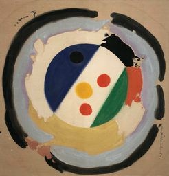
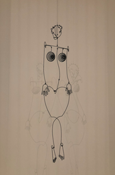
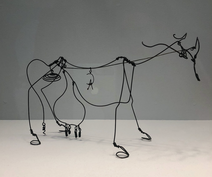
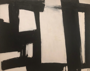
Aztec Josephine Baker: I LOVE the hands on this piece. The medium is something I want to explore further and practice with, along with the style. He somehow makes the figure so simple but captures all the necessary details. The curves of the legs and body are so basic but perfect and I love it. Its not all completely attached so it is not truly one line but it gives the appearance. The presentation of the piece adds to it because of the shadows on the wall. Cow: This piece is so detailed but also so simple and it amazes me. I want to learn more about his process and how he creates such small bends and loops in the wire and what exactly what materials he uses. Consequence: This isn't Alexander Calder or actually one line but it still inspired me. The layers of broken lines is something I want to explore with my play pages. My play pages have become really specific and repetitive and I want to branch out from it (even though I love it). I really want to paint and I think this would be a good approach (painting with multiple lines and just letting loose with it). I feel like incorporating a style like this in my ABEX piece would be beautiful. 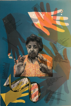 Howardena Pindell changed the purpose of her work while keeping the same undertone of a particular style in each of her pieces. While she changed her media frequently, she kept the sporadic yet purposeful placement of elements as a theme in each of her series. Each section (Memorist, Traveler, Activist, and Scientist) connects to a part of her life and allows her work to develop with her while also giving a detail explanation as to why. Her work developed with what was going on in her life, like her accident in 1979, to what was going on in the world that inspired her more 'social justice' like pieces. Separating her work into four sections allows the audience to absorb the deeper meaning in each art piece. For example, I was captured by Pindell's DNA piece because of the connection to her memories and the importance of the hands (as they are what creates the art and part of one's identity because of their unique fingerprint) With the work organized into a section, Memorist, I formed a better understanding of the piece and its purpose after learning about her accident and why she felt the need to make the pieces based on herself as an entity. Each section shows her development as an artist and separates it into broad stages. Studying her work shows other artists how your art will change based on what is going on in your life. While that could mean a change in subject it could also mean a change in medium or style or purpose, for example her pieces in The Shape of Numbers series versus pieces such as Autobiography: Air (CS560) . Bringing your work back to yourself and allowing it to change with you as you develop as a person is what Howardena Pindell is expressing in her different series and it what other artists should be encouraged to do. 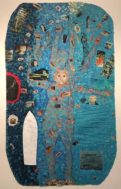 Her work had many striking aspects to it, which led it cover many Artist Habits of Mind. The few that stood out to me were Engage & Persist, Envision, and Express. Her art always sprouted from personal interest or the message she wanted to leave on the art world. With mixed media pieces she created many activist pieces that strongly expressed her opinions on different issues at the time. She created abstract pieces that seemed slightly chaotic but every single one of them had a method to their madness. The way she made art was so creative in itself and the way she managed to put such a powerful meaning behind all of her pieces makes it so much more awe-inspiring. Most of the steps of the Artist Process can be found in her pieces. The information given about each piece and section of work show the inspiration behind the piece which explains the main focus. There's not much present evidence of planning in her work, which is the only step of the process that isn't evident. The creation of her work is what is displayed on the wall, specifically zoning in on the use of each material and how she manipulated it. Lastly, the reflection of her own work is shown thought the following pieces and what she learned from her different experiments with different medias and techniques. My own work recently majorly changed. I currently have many series planned that I hope will express a deeper meaning (one that I formed based on what is going on in my own life). However I do make a lot of work that is simply me messing with a pen and nothing more, but I find satisfaction in having an aesthetically pleasing piece or just an image that pleases the mind without having to think of the meaning behind it. Part of my current work connects to the meaningful series-style of Pindell but the other half contrasts to what was displayed in the museum. First Image: Pindell/DNA, 2012, offset lithograph, Edition 9 of 40 Second Image: Autobiography: Air (CS560), 1988, Acrylic, tempera, oil stick, blood, paper, polymer photo transfer, and vinyl on canvas Abstract Expressionism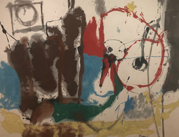 HELEN FRANKENTHALER American, 1928-2011 Mother Goose Melody, 1959 Oil on Canvas  MORRIS LOUIS American, 1912-1962 Claustral, 1961 Oil on Canvas These two above images contrast as one falls into the category of abstract expressionism and the other is none objective. The Abstract Expressionist piece has expression and meaning shown through the brush strokes and purposeful mark making done by the artist. The none objective piece had an aesthetic goal, but it is not expression a specific emotion or scene. 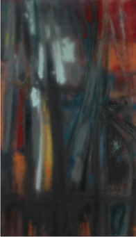 HEDDA STERNE American, born Romania, 1910-2011 No. 3 - 1957 Oil on Canvas Abstract Expressionist work shows the relationship between the artist and the canvas and how the artist interacted with it. These pieces often have an assortment of colors, especially color-field works.. This piece has obvious motion and mark making with each brush stroke. It is a dynamic piece, and each mark has a specific and meaningful purpose.
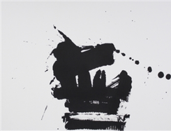
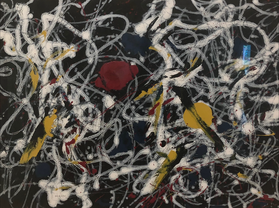
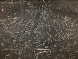
 RON GORCHOV American, born 1930 Wedding, 1979 Oil on linen Each of these pieces has blatant mark making and movement. The piece by Jackson Pollock holds a story because of the layering and how the lines flow dynamically. The Twombly piece holds a story in because of the lines and how they draw your eyes to other parts of the board in order to put the piece together. Lastly, the Gorchov work shows large brush strokes that were most likely made from the shoulder. They seem slower than the Pollock painting, mostly because it is acting as a background and does not have a point to being more complex.
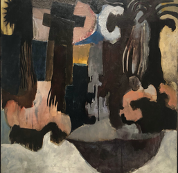
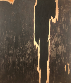 CLYFFORD STILL American, 1904-1980 1965 No. 1, 1956 Oil on Canvas Lastly, these images above show the artists process and goal through the elements of art and the principles of design. Each piece has line, color, and mostly likely a suggested form. Each of the principle designs can be used in every piece because it is what makes a piece different from the others.
|
Julianne
|
 RSS Feed
